Form: Entry 6


Response to ‘Power of Good Design’ & ‘The Demise of Form follows Function

Form follows function. Most modernist designs live by this rule. Famed designer, Dieter Rams proposes that good design should follow a few rules: be user-friendly, be environmentally friendly, be well produced, be timeless, and be modern while still allowing users room for self-expression. Considering that most modernist pieces have kept their timelessness, I think that Rams’ rules are very accurate. The New York Times, however, has proposed that such rules of design are no longer necessary as more of an item’s function can be fit into smaller and smaller spaces. Their case in point was the 2009 iPod Shuffles that were, in form, clips but, in function, trumped the computing capacity of all of NASA’s early systems.

Good design should be more than just surface level. The New York Times ignores that fact that Apple’s design team ignored some fundamental rules when they created these and thus have created a product that is unlikely to see the resurgence years later. On the other hand, the modernist chairs that people like Rams have created will continue to make resurgences as people rediscover the quality, design, and durable creation that make things timeless. Rams’ rules are not to be taken as needed but as a sum whole. Users will not like a product if it is not durable and unobtrusive. Products will not be timeless if people don’t like them and they are stuck in a single time period.
Form: Entry 5

Assignment 2

Rules:

  • a Monopolyesque game piece
  • 1.5″x1.5″x2

Inspiration:

Monopoly pieces are the vaguest concept of a thing. Beginning with the original zinc alloy set, Monopoly pieces have ranged from howitzers to houses, from terriers to tanks. The only common denominator has been their size at about 2’x2’x1.5′.

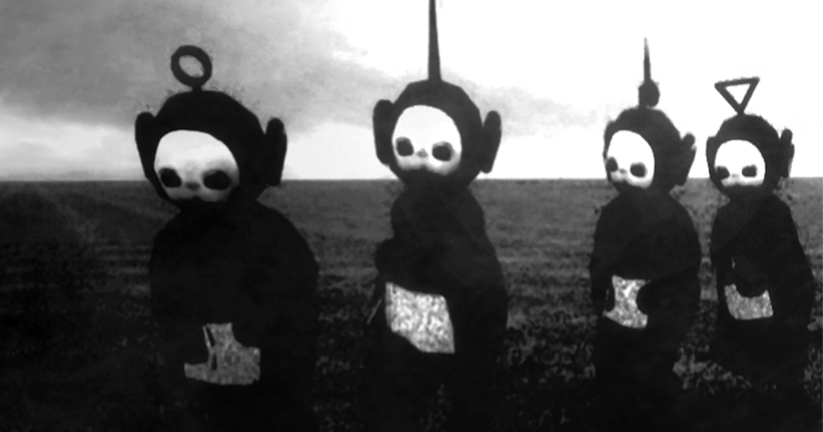
I wanted something I could use. There were few things that are usable that are that size except for trinkets that I could put on my key ring. I had watched a disturbing music video involving black and white footage from the Telly Tubbies and one of them – Po – had a ring on his head that I could use for the key ring. I was also  against direct plagiarism so I looked in the artist Ron English who makes dark recreations of pop culture icons. I also looked at some of the pieces Kid Robot had done involving perversion of the same.

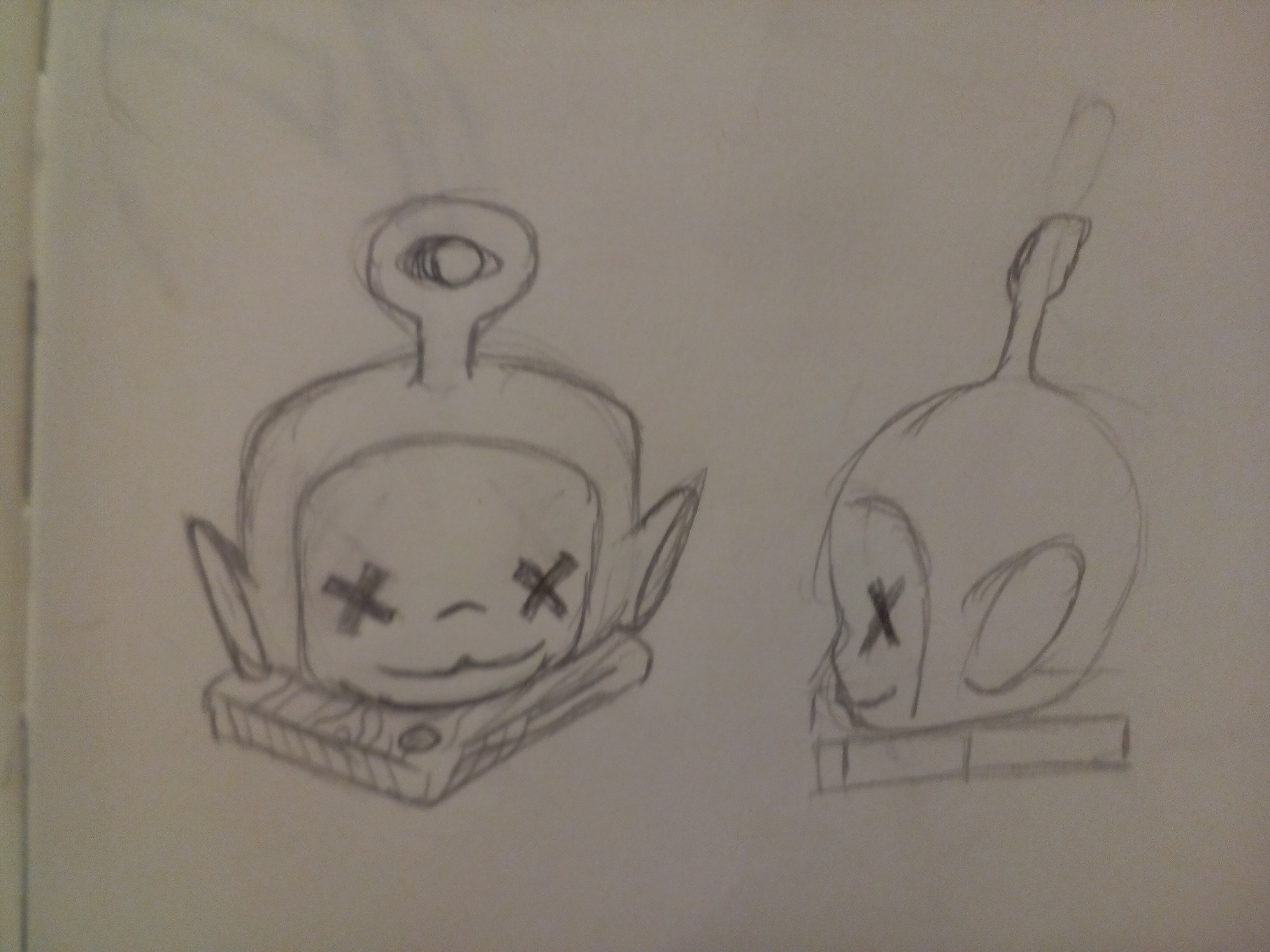
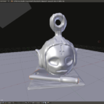
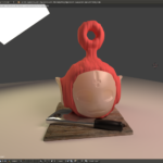
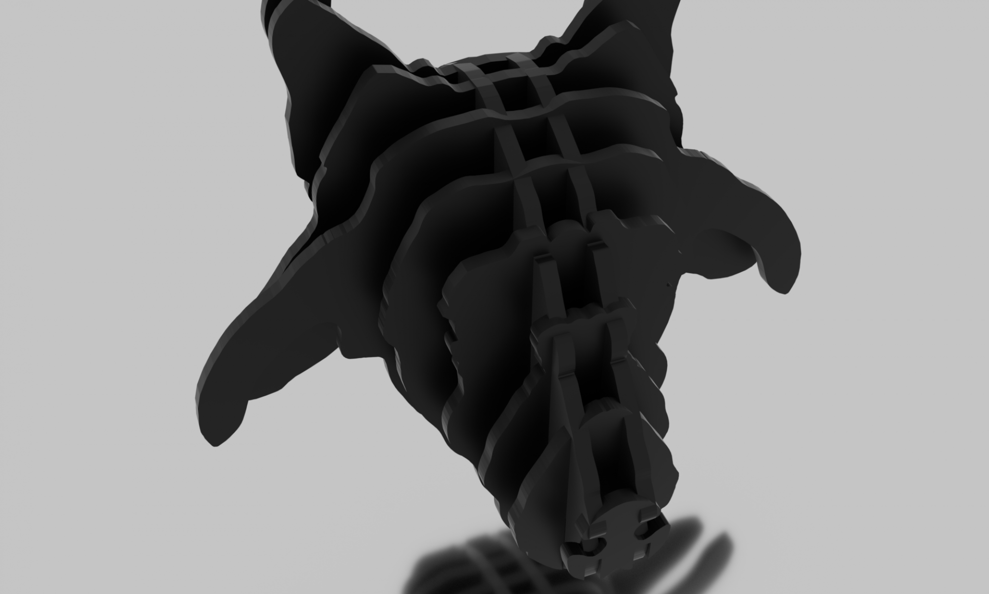
I settled on Po’s head on a chopping block in a World of Warcraft/League of Legends  style of exaggeration.

Clockwise from left: Ron English’s ‘Telegrinne’; overposted image, author unknown; Po from the original British series; Black & White Image from ‘Christopher G. Brown’s Teletubbies Joy Division Edit’

Model:

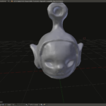
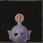
The model was fairly simple I started with a sculpt and then retopologized it so it looked better. I tried to create the crossed out eyes I had in my sketches but my model’s eye sockets were too deep and the crosses didn’t look right. Instead, I opted the cross of St.Peter, often mistaken for the Satanic Cross, on his forehead a la Deicide. I thought about changing the headpiece to a proper satanic cross but there is no loop to attach it with.

Form: Entry 4

Project 1: Moodboard & Sketches

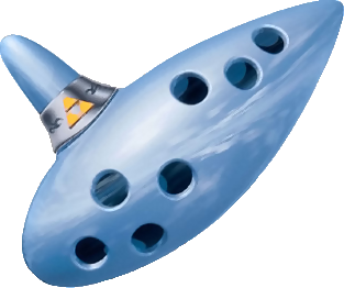
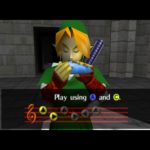
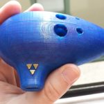
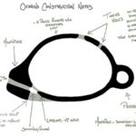
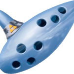
Cyron and I decided on recreating the Ocarina of Time from the video game of the same name for our first project. As it is a hollow object it will be necessary to create two sides of it and glue them together. It could also be possible to print locking joints but since the Ocarina is a type of whistle, the glue will hold it together better and, hopefully, make it sound okay.


The Ocarina of Time

Form: Entry 3

In Response to Alain de Botton: “Why design matters”:

In Why Design matters, Alain de Botton argues that good design makes people better and that people have emotional attachments and aversions based on the looks and feel of things. Good design can take many forms: sups, phones, sunglasses, and even the small dongles and knobs attached to everyday objects. Unfortunately, bad design is even more common.

Take the design of Colorado cities. I hate them. They popped up overnight and had a checklist to fill out. Houses. Check. Schools. Check. A place to get necessities. Check. But they lack character. The houses are all the same. You must drive everywhere. The schools look like prisons. I could take a picture in any one of these pop-up towns and you couldn’t tell me where it was taken. Everything in it looks the same. On a surface level, though there are changes, the color might change from one corporate approved color to the next but the urban planners at these development companies must be alcoholics because they are forced to create such unfriendly cities.

Now take a city with good design. Take Barcelona. Each city district has a crossroads dedicated to commerce and pedestrian walkways to make each district more livable. The intersections are also more open to allow for café seating and, on occasion, are closed to cars. The city is livable and thriving as it was designed not despite it, like what we have in Colorado.

Form: Entry 2

Practice

Rules:

  • A teapot

Inspiration:

I have always like modern teapots to the point that whenever I am in New York I will go to the Met to see the teapots. I selected the modern one because of its relative simplicity and functionality.

DSCF6743

A modern teapot

Model:

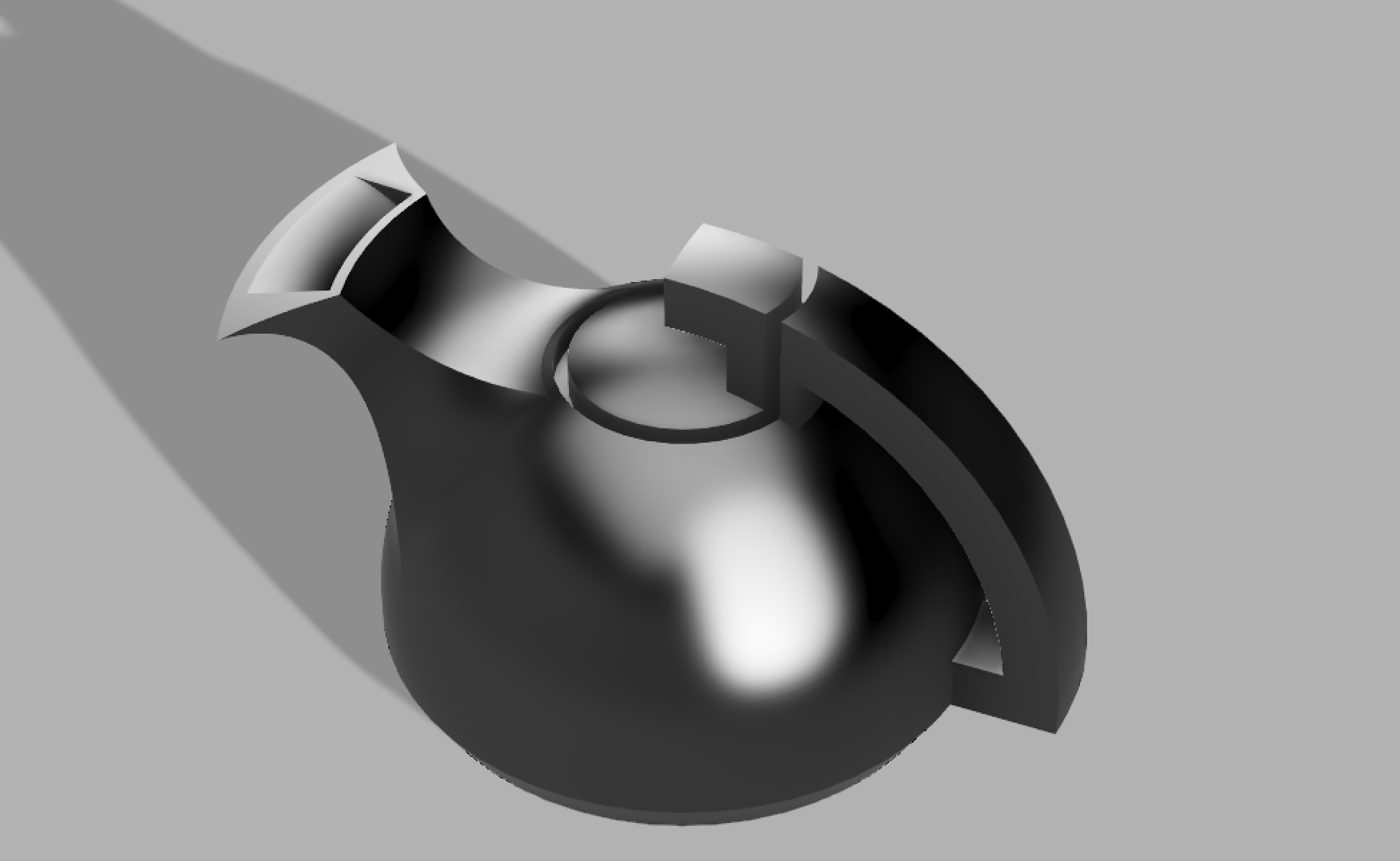
I created a modernist teapot for practice with Fusion 360. The spout presented a challenge as creating the end was harder than I initially thought. Fusion 360 is built like an Apple product by prioritizing slick design over usability and using a cloud-based rendering engine. Despite the drawbacks, I believe the teapot looks functional.

Final Render

Final Render of Teapot

Form: Entry 1

Assignment 1

Rules:

  • 3’x3’x3′
  • Functional
  • Inspired by “The Bus”

Inspiration

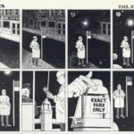
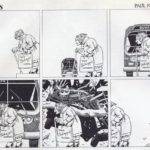
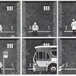
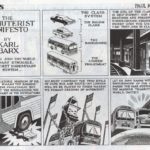
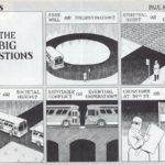
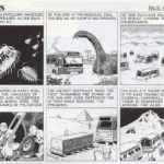
I read Paul Kirchner’s “The Bus” a while back and was inspired by how he was able to write a whole comic series using only a few characters and no dialogue. The book was quirky and surreal. I really liked it, particularly  this self-referential one here:theBus3

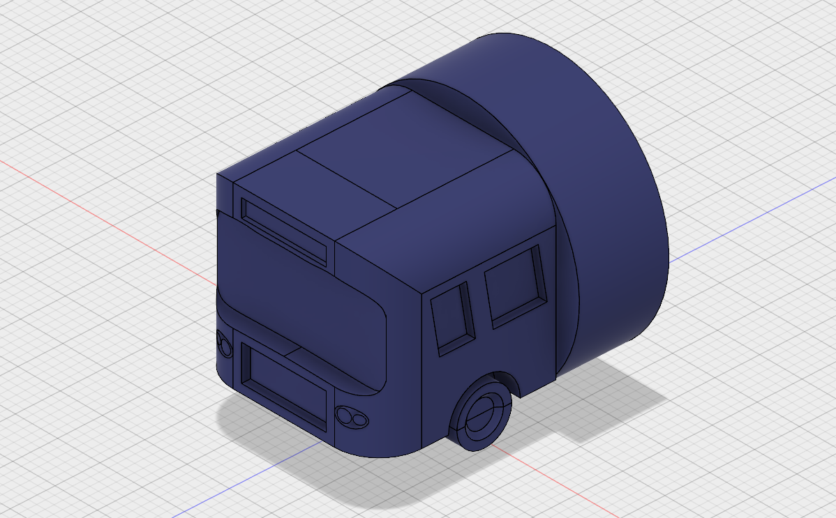
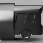
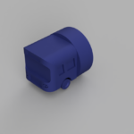
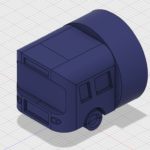
I also needed something to craft The Bus into. I am not a material person so just a model of the bus was not going to cut it for me. I decided on a water bottle top as it is both functional and novel, without adding extra weight.

Model

The modeling was a bit harder with the bus given the number of parts needed to create an accurate bus. The windshield, in particular, was challenging as it was curved in an organic fashion and simple cylinders would not work. Unfortunately, I was unable to find the specifications for the screw lid for my specific bottle and had to approximate.

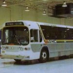
Paul Kirchner’s “The Bus” and the 1970 GMC Suburban Charter were my inspiration

IMG_20170912_091237

First round of bottle top sketches

Process Images and a few final renders