Motion: Entry 12
Mood Board: Audio Visualizer
I was always a fan of trippy animation. While After Effects is not the best medium for hand-drawn animation, I think that by using only a few frames of drawn animation and interpolation between the frames using keyframed shapes, I will be able to achieve an approximate effect.
Motion: Entry 11
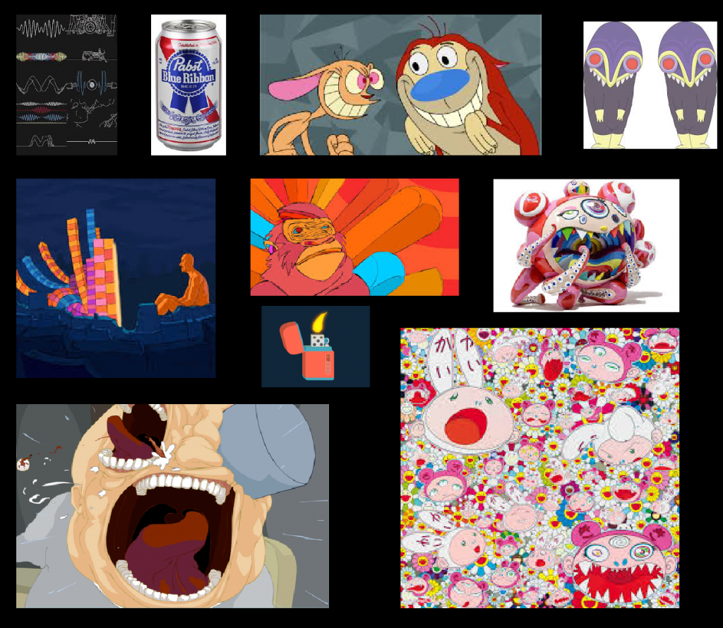
Creative Brief: Audiovisualizer
For this project, I will be using a piece of music I made for Sound. While the music is not very good, the rhythms and movements are easily discernable and I will be able to map all of the different tracks to their own shapes.
The song is fairly upbeat and has a lot of varying sounds in it. I think I used a bottle opener and a lighter and a few other physical items to craft the song. For this, I want to use short repetitive graphics of the physical objects using path shaping. The shapes will also morph and scale as they fade and are changed in the song. Lastly, I want the colors to be vivid and bright on a black background to contrast the melody from the electric guitar.
Motion: Entry 10
(Mini) Audio Visualiser
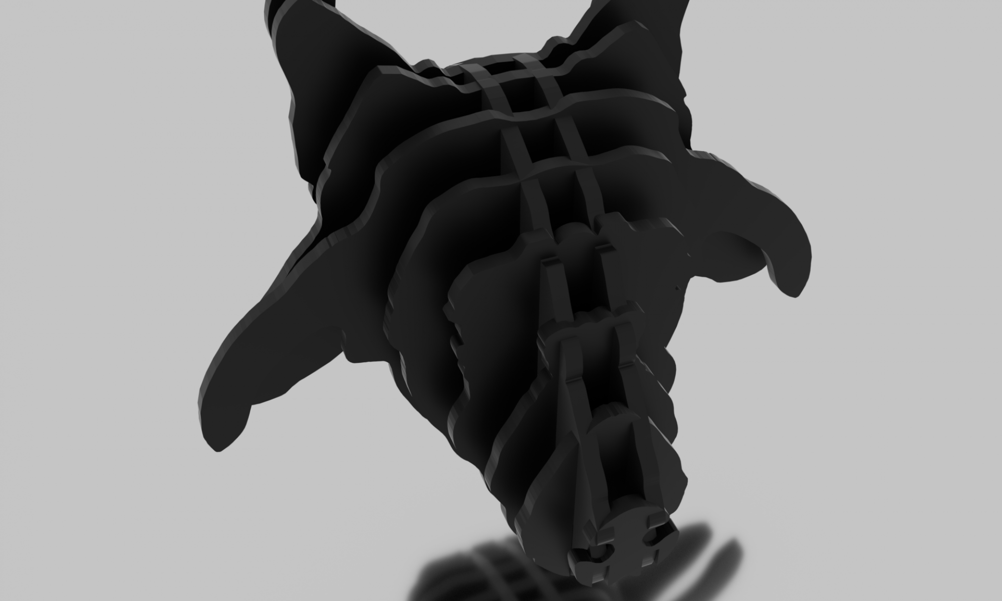
Motion: Entry 9
Expressions
This is a short clip using expressions to control gears and make sure that, through math, the gears are in sync forever.
Motion: Entry 7
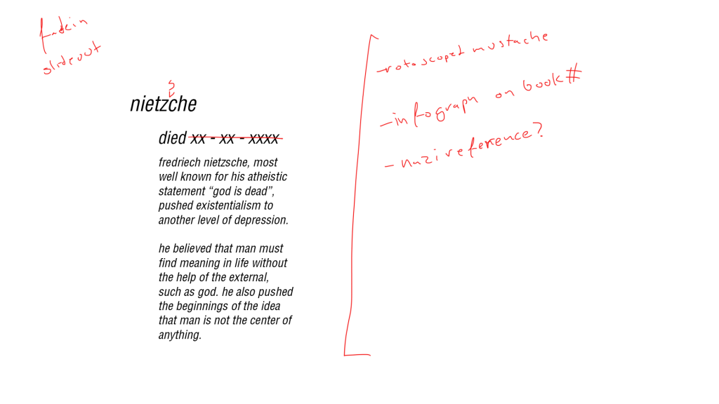
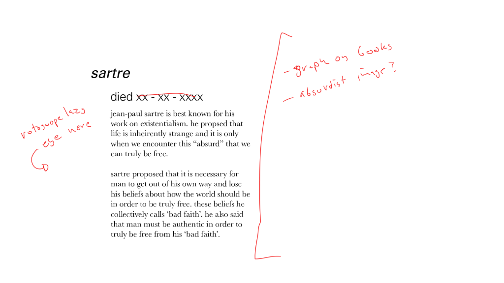
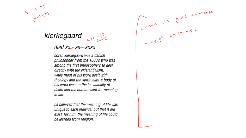
Project 2: Creative Brief & Story Board
For Project 2, I will be using the assets and data from one of my previous projects in Text. I will also add a voice-over as many of the infographics is about notable philosophers and their lives. It will also include some death metal music to accentuate the nihilism and as well as make the voice-over less jarring.
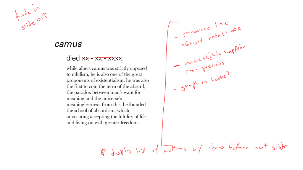
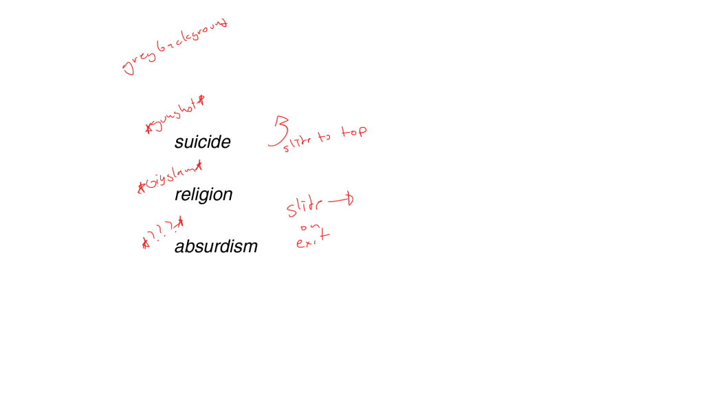
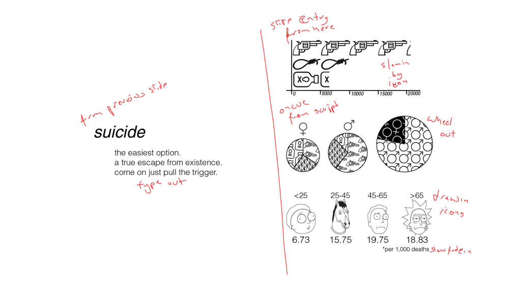
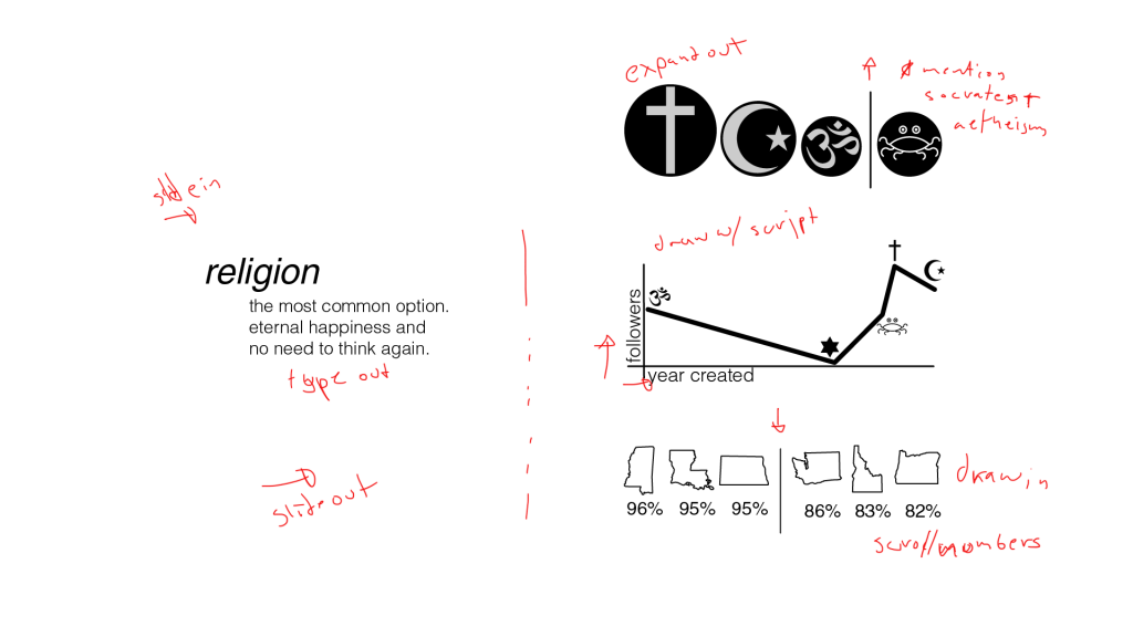
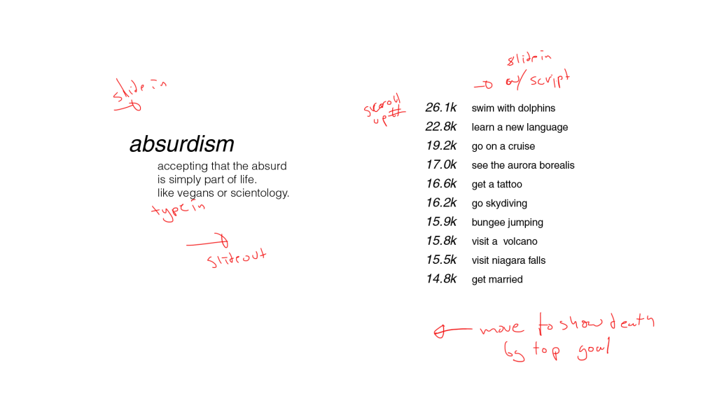
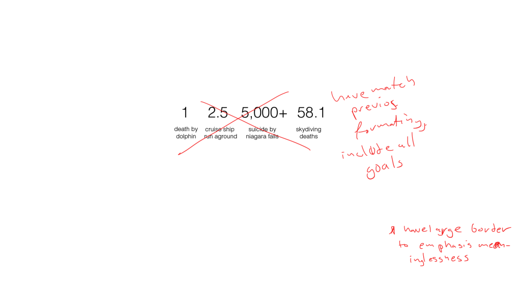
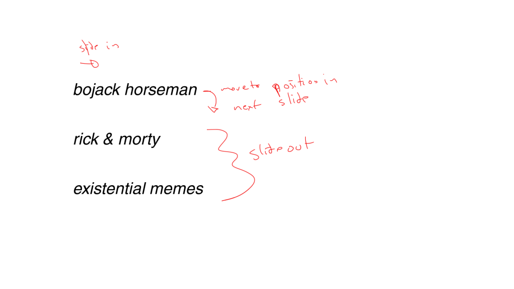
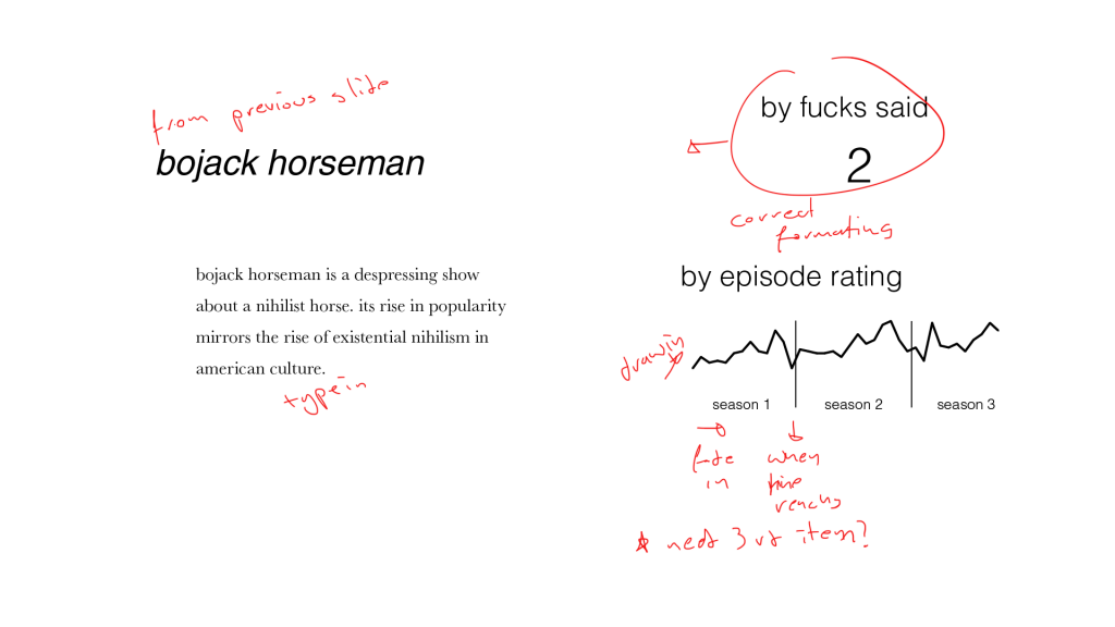
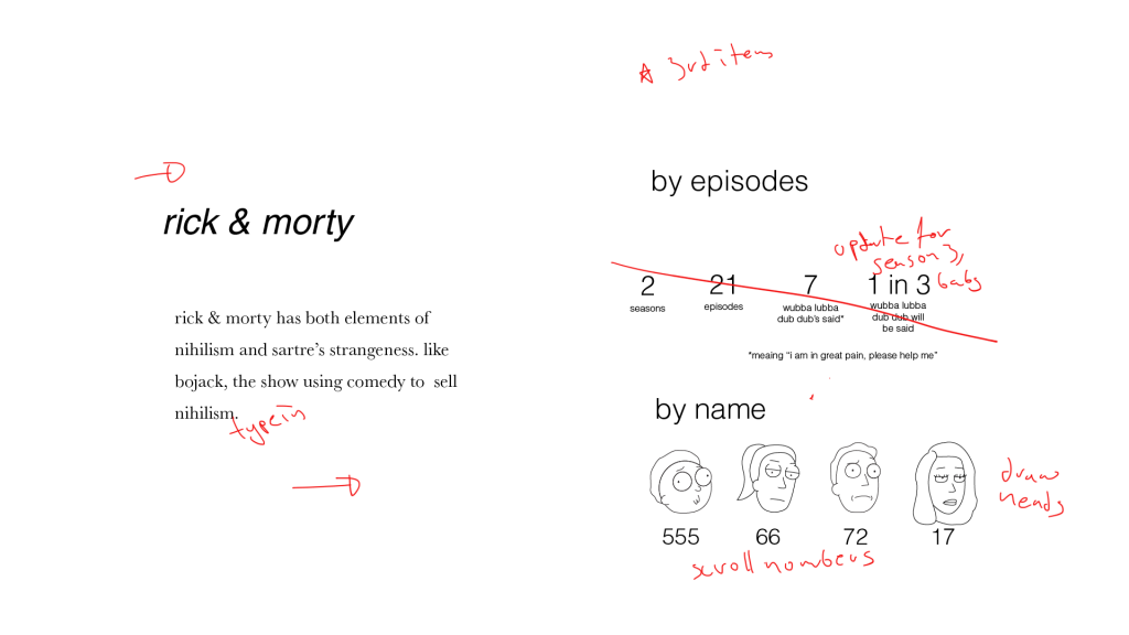
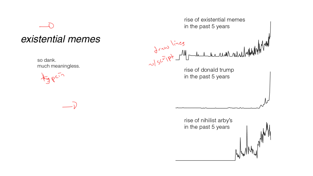
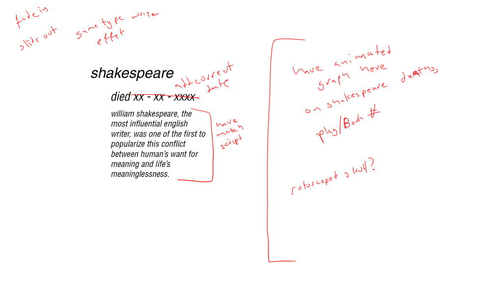
The project will cover the subject of nihilism. It will start with a brief overview of the history including notable philosophers such as Camus, Nietzsche, Sartre, and others. Though these philosophers are not nihilists in a strict sense, their radical departures from their respective milieus have influenced the modern manifestations of nihilism. The next short section will cover the modern manifestations of nihilism including Rick & Morty, BoJack Horseman, and another because three is a good number. The last section will look at what Camus’ considers the three reactions to nihilism: religion, death, or embracing the absurd. These will be written as stats about death, religion, and absurdism and a departure from the normal.
All backgrounds will be in grey and all writing will be in Helvetica or Univers in black with no capitals. In order to add life to the project without starying from the theme, I will have rotoscoped icons and figures in black which will contrast with the flat typography on grey. Rotoscoped images will also add to the absurdist views that I incorporated from Sartre and Camus.
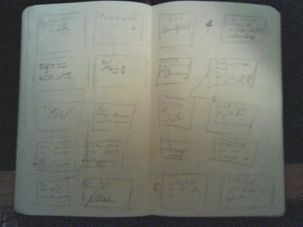
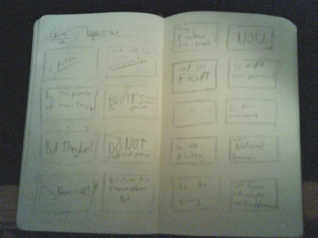
Story Board
A single frame is not missing explaining the meaning of this infographic.
Motion: Entry 6
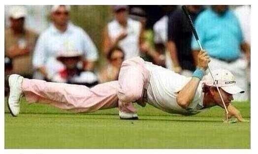
Funny Walk Cycle
As inspired by the below picture and Monty Python, I made the following victorian man. Made in Aftereffects.
Motion: Entry 4
Project 1: Rough Cut
For my Project 1, I chose to create kinetic typography of Charlie Chaplin’s Speech at the end of the Great Dictator. I went with a fairly simple faded parchment background and started blocking out the scenes. I choose a gothic font, Black Family, as with as a more legible calligraphy font, Pirata One. Because of the strong lines in the font as well as the speed of the speech, the animations of the words will have to be limited to rotations and movement. Stretching the characters or have more intricate effects would be detrimental to the meaning and cohesion of the overall film.
This rough sketch is less than it should be but I feel the idea is visible and the completed cut should capture the feeling of the speech well.
Motion: Entry 3
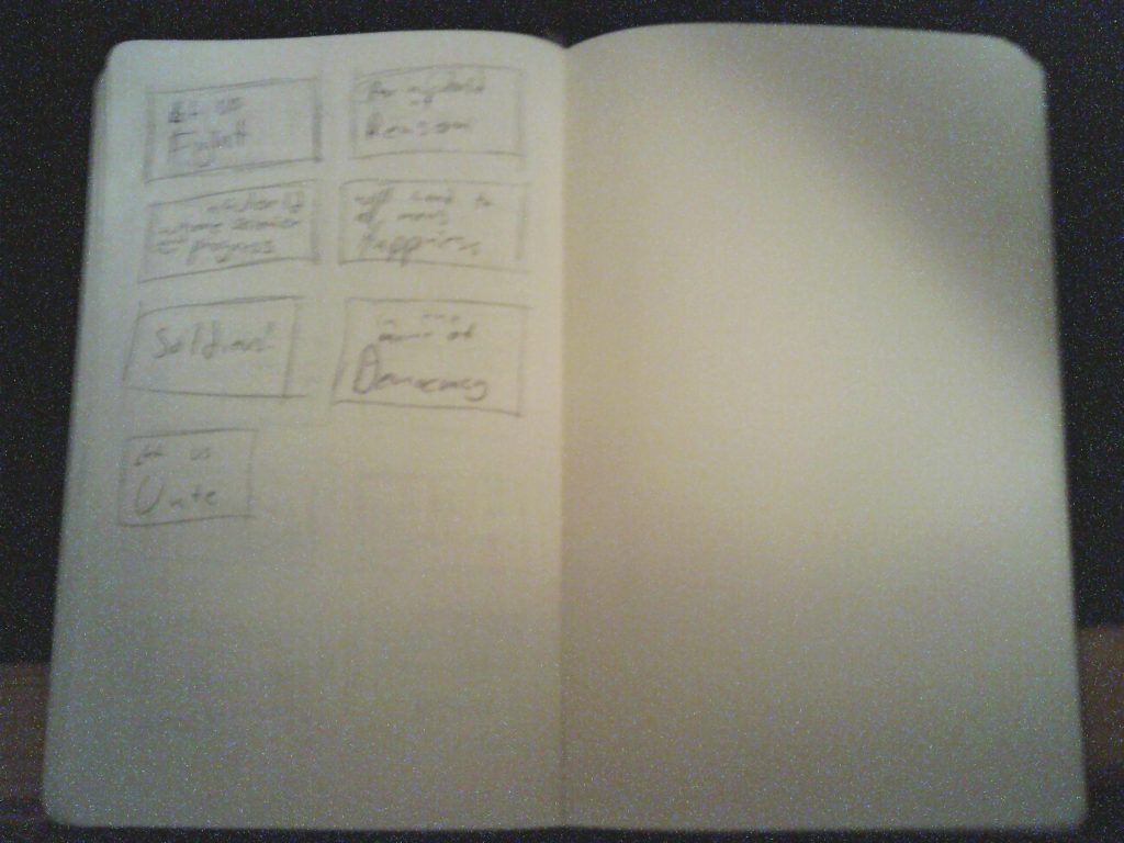
Project 1: Creative Brief & Storyboard
For this project, I will be using Charlie Chaplin’s speech from the end of the Great Dictator. It is an invigorating speech about how man has the power to affect his future and how he should do his best to create a positive future free from dictators and greed and hate and intolerance. I feel the speech speaks to the current rise of popularism and authoritarianism. The speech has two motifs I want to use. First, it quotes the Bible. Second, it repeats itself with slight variations.
In order to capture the motifs as best I can, I want to use yellowed paper backgrounds and calligraphy fonts for most of the words. I will also like for the words to sort of ripple on the “page”. This should reinforce ti victorious feel of the speech. Lastly, I want to reuse portions of the text to reinforce the point. For example, when he says, “Let us use that power… Let us all unite… Let us fight for …” I will circle back to the same set of text.
Storyboard
The repeated phrases will ideally look similar. The “Let us [x]” will have the same basic frame each time.
Motion: Entry 2
Personal Banner
For my personal banner, I used the logo I had made for Intro to Design. The logo itself was made to look like a stylized 1980’s kanji (which I can’t read) while still being vaguely recognizable as my nickname: Azi. I kept with the 1980’s aesthetic with the chrome and white, inspired by the THX logo.