Project 1
The first project for Motion. Completed Using After Effects. Speech is from the Great Dictator starring Charlie Chaplin. Fonts used are Pirata One and Black Family
The first project for Motion. Completed Using After Effects. Speech is from the Great Dictator starring Charlie Chaplin. Fonts used are Pirata One and Black Family
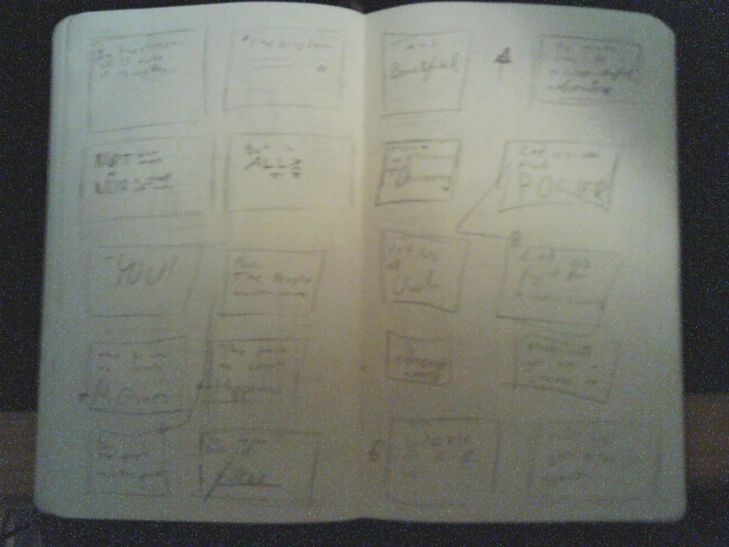
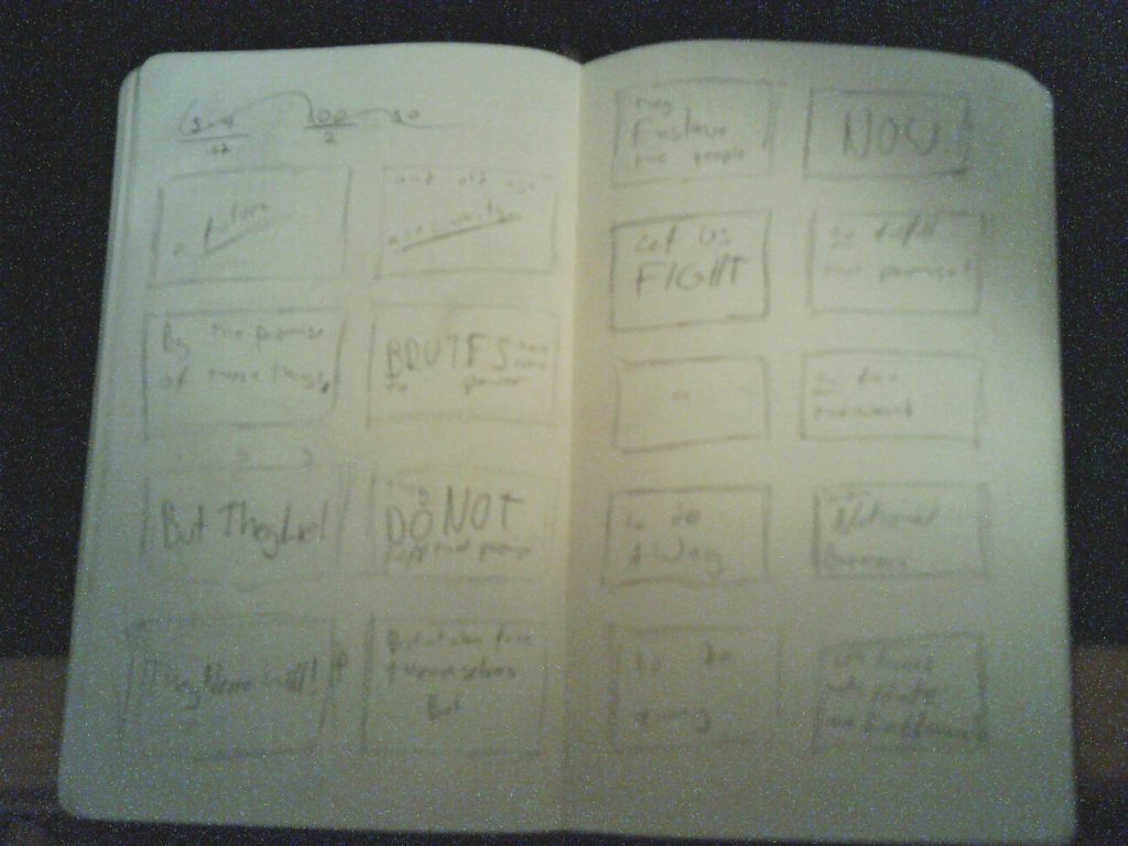
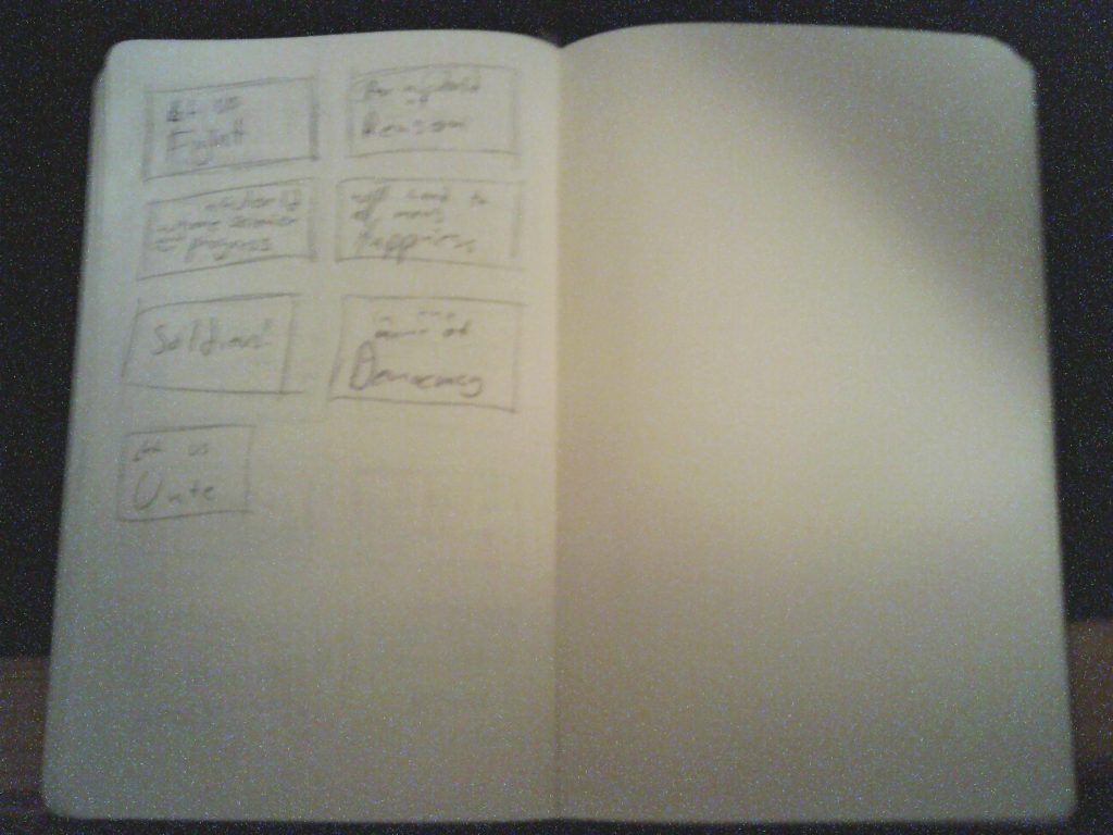
For my Project 1, I chose to create kinetic typography of Charlie Chaplin’s Speech at the end of the Great Dictator. I went with a fairly simple faded parchment background and started blocking out the scenes. I choose a gothic font, Black Family, as with as a more legible calligraphy font, Pirata One. Because of the strong lines in the font as well as the speed of the speech, the animations of the words will have to be limited to rotations and movement. Stretching the characters or have more intricate effects would be detrimental to the meaning and cohesion of the overall film.
This rough sketch is less than it should be but I feel the idea is visible and the completed cut should capture the feeling of the speech well.
For this project, I will be using Charlie Chaplin’s speech from the end of the Great Dictator. It is an invigorating speech about how man has the power to affect his future and how he should do his best to create a positive future free from dictators and greed and hate and intolerance. I feel the speech speaks to the current rise of popularism and authoritarianism. The speech has two motifs I want to use. First, it quotes the Bible. Second, it repeats itself with slight variations.
In order to capture the motifs as best I can, I want to use yellowed paper backgrounds and calligraphy fonts for most of the words. I will also like for the words to sort of ripple on the “page”. This should reinforce ti victorious feel of the speech. Lastly, I want to reuse portions of the text to reinforce the point. For example, when he says, “Let us use that power… Let us all unite… Let us fight for …” I will circle back to the same set of text.
The repeated phrases will ideally look similar. The “Let us [x]” will have the same basic frame each time.


For my personal banner, I used the logo I had made for Intro to Design. The logo itself was made to look like a stylized 1980’s kanji (which I can’t read) while still being vaguely recognizable as my nickname: Azi. I kept with the 1980’s aesthetic with the chrome and white, inspired by the THX logo.
This video by Patrick Clair is a great example of an explainer video. In the video, the graphics are used to accentuate the speaker’s points and include the bullet points for the speech. It explains what Stuxnet is and how is being used as well as the potential for its abuse by private individuals or countries. The video also has an aesthetic similar to zombie thrillers, drawing an analogy to fictional epidemics.