App Dev: Entry 7

Project 2: Milestone 4

Post-mortem. While Android is far more universally used. It has had trouble unifying it’s look and code protocols. I found this to be a problem when trying to create my Project 2 as some articles said one to add settings while other said another way. While I could have ditched using Preference class, and used data persistence and hand code activities, I tried to code within the confines of Android.

Process. I defaulted to w\finishing my app at the last minute. I assumed it would be as easy as Apple was with a single way to do anything and good documentation on how to do it. It was not. I should have tried to do things another way when using Preferences didn’t work. As Android doesn’t have a set of a look, cheating out a set of settings would have still looked “Android”.

Going forward. I liked the design of my app and the general idea. If I was to make a v2.0, I would make the settings in a drop down as was originally planned. I would my also drop data persistence as it is not super necessary for such a simple app. Lastly, I would add some drop shadows and adhere to Material Desing a bit closer.
App Dev: Entry 6

Project 2: Milestone 3

The finished product. Or at least as far as I was able to work on it without tearing out my hair in frustration at the run around between Google’s documentation and what developers were saying on Stack exchange.

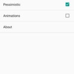
My app turned out fine except for the inability to retrieve the SharedPreferences. I added a second Settings Activity from the built-in menu assuming that it would have nice documentation and pointers on how to get it to work. There was some. Unfortunately, it mostly said that it should automatically store all values. Somewhere between that and retrieving them, something broke.

I searched across the Internet for someone to point out how it all could be assembled, but everyone seemed to be asking some slightly different question with slightly different answers in response. So, like a good programmer, I tested them all. Nothing seemed to work. And now I’m left in amazement that Google didn’t have some foresight that people might not have hubris and use their pre-constructed Activities.

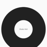
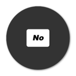
The final look of the app was about what I had hoped for in the beginning. Nice minimalistic. Now if only the damn thing worked.

App Dev: Entry 5


Project 2: Milestone 2

Android is harder than I previously anticipated. Unlike iOS, where everything has only one right way, Android has many ways to do things that seem to change from patch to patch as few of third-party documentation were consistent.

In particular, I was looking for the “right” way to have settings as an overlay after clicking a hamburger nav. However, in addition to there not being a consensus on how to properly do it, the language that Google added, in the form of “Toasts” and “Snackbars”, makes it even more difficult to understand if what I have been reading for the past fifteen minutes is actually relevant or not.

I was able to add most of the functionality. This includes the menu that changes as well as the shake function. I stil have to implement the final app design to be more minimalistic

App Dev: Entry 4

Project 2:  Milestone 1

For the second project, I wanted to be less useful. While it is nice for all apps to be useful in a strictly productive manner, a lot of apps are needed to fulfill every niche idea that someone has:  poop tracking, virtual fidget spinners, Vedic astrology, you name it there’s an app for that.

However, when I was looking for Magic 8-Ball apps that followed Material.io’s guideline, I was at a loss as most apps on Google’s play store are rather ugly and lack the consistent, paper-esque quality that Android apps should have.

My second app will be a pseudo-random number generator in the form of a magic 8 ball. Users will shake the ball (phone) and have a “random” answer to their question. I will also add on options for extra negativity to go with the drab gray theme as well as an option for expletives, in case of very serious matters. I believe a material compliant dice roller would be a nice addition to the Play Store.

App Dev: Entry 3

Project 1: Milestone 3

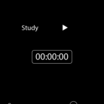
The final project turned out about as well as I hoped for. The sound cuts out and the timer stops when the app is closed. The colors I was also able to change to white on black which makes the app less inviting. I was also able to make the sound smooth even when all sliders were in use.

The coding is a bit unconventional. Instead of using the buffer from the audio engine built into swift,  I created  timer to add a new version of the audio clip after 4 seconds which will create a memory leak due to the clip being a tenth of a second longer than the timer. Originally, I stopped the audio player and restarted it each cycle but the delay of stopping and starting made the playback choppy.

The oscillation is also hacked together. The audio engine should be set up with an oscillator node but due to it complexity I created a timer that changes based on the volume and, using a sine wave, updates the volume every .1 seconds.

Going forward with the app, I would like to make the sound modulation better as the current sound becomes a whine when put up to higher frequencies. I would also expand the button area to encompass more of the screen. I would also like to add multiple frequencies that the user can choose from instead of modulating a single sound. Lastly, the app should tack study time and give a report based on the persons study habits and give advice to study more, study less or invite the user to get a different app if they are using it for sleeping.

App Dev: Entry 2

Project 1 Milestone 2

Prototyping.  As far as apps go the interaction will be fairly simple: the user loads up the app and can then turn the noise on or off with the timer resetting each time the app is stopped. I was thinking about adding more functionality to add a count down timer so the user could study for thirty minutes but given how bad I am at prolonged work, I think the simple time keeping is enough to keep users on task.

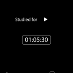
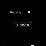
The design of the app is white on black as opposed to the usual black on white. The mostly black design will be less distracting while also providing constant reminders of how little much time has passed. I decided against the previous pastel coloring as it appears to inviting and users may be tempted to pick up their phone if they see anything on it.

The sliders each control a metric of the white noise: the volume, the volume oscillations, and the pitch or Hrz. The pitch and the Hrz are built into the Apple Audiovisual SDK. The volume, I may remove as it is redundant because of the external buttons.

I have run into several road blocks on creating white noise using Apple’s SDK. Chiefly, the noise generators, while easy to understand then expected, are primarily designed for single notes which might make a jingle or help in creating an equalizer. White noise, however, is a random sampling on noises primarily around one note but with enough randomness as to not be musical but itself.

Link to Invision prototype: https://invis.io/XWOE9BWN4US#/323587385_Untitled-1_Opened_Copy